This post contains affiliate links, to learn more, see my Disclosure Statement.
Exterior and Downstairs
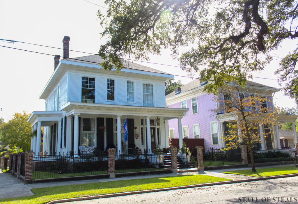
My husband and I were on a mission to renovate a historic home when we found ourselves transplanted into Mobile, Alabama in 2018 and we toured countless homes, but nothing felt quite right until this one. This house was a blank canvas because it had been spared by decades of renovations that so many historic homes are subjected to. While it was barely habitable in the condition we bought it in, her potential was clear to me!
We both work full time so we used a local general contractor, but stayed heavily involved in the construction process. I called the shots on design and the few layout changes. (It was important to us to retain the original floor plan as much as possible.) Overall improvements throughout consisted of:
- New wiring and light fixtures
- New plumbing
- Floor refinishing
- Fresh wall and trim paint
- Window repairs
- A/C repairs
Exterior
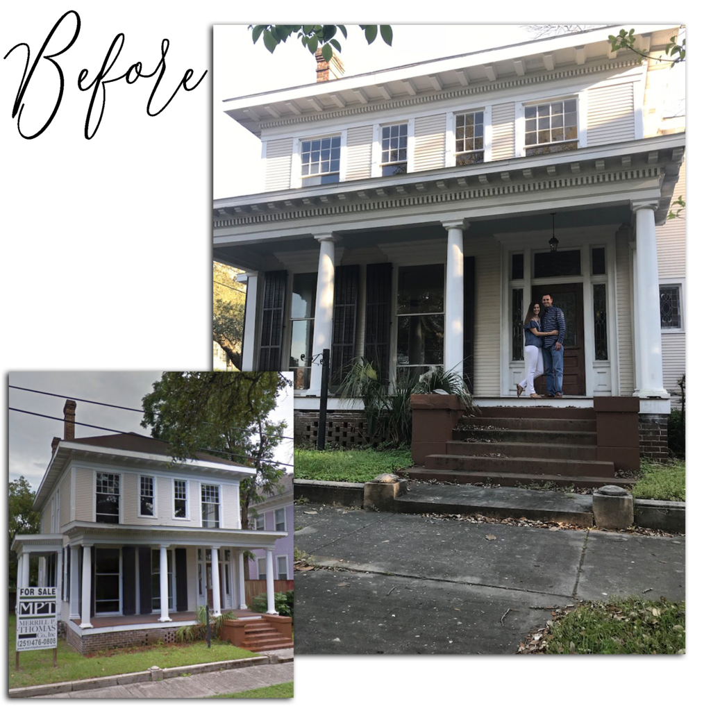
Look at those kids, so optimistic and naive thinking this remodel will be done before their short-term rental ends, HA!
The home was built in 1910 and is known as one of the sister houses. The original builder built our house and the neighboring house for his two daughters and they were designed to be completely identical so that his daughters wouldn’t fight over who got the better house. (Some things never change!)
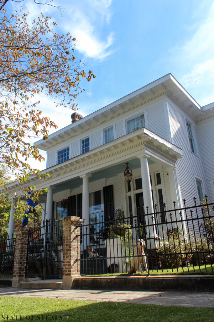
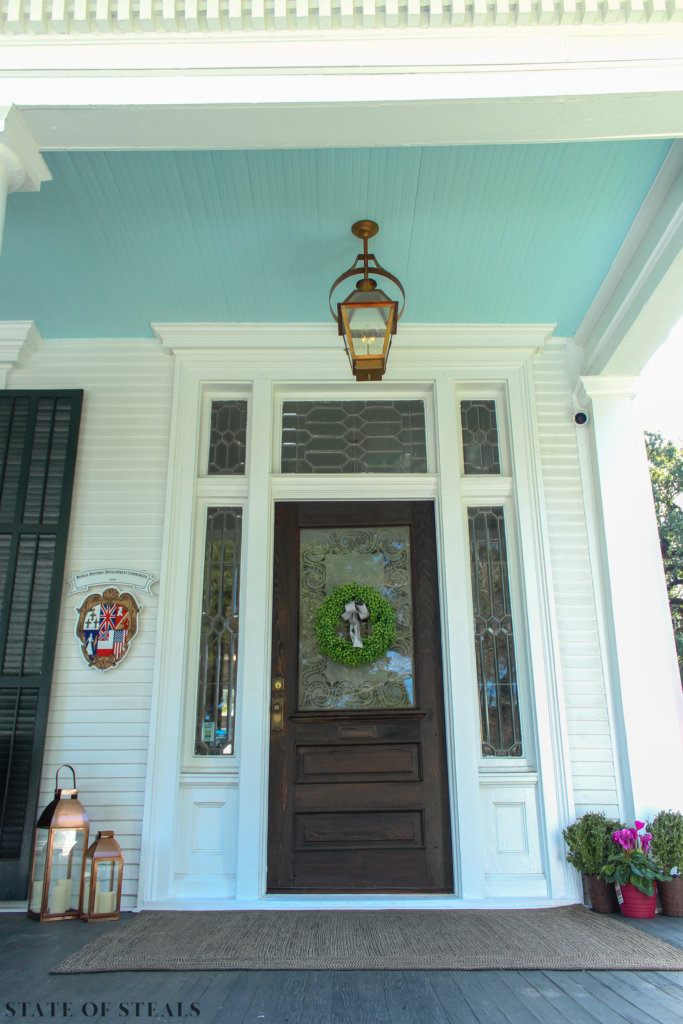
What we did:
- New roof
- Paint
- Landscaping
- Brick and iron fence – brick reclaimed from demo’d wall and pavers in the backyard
Entry
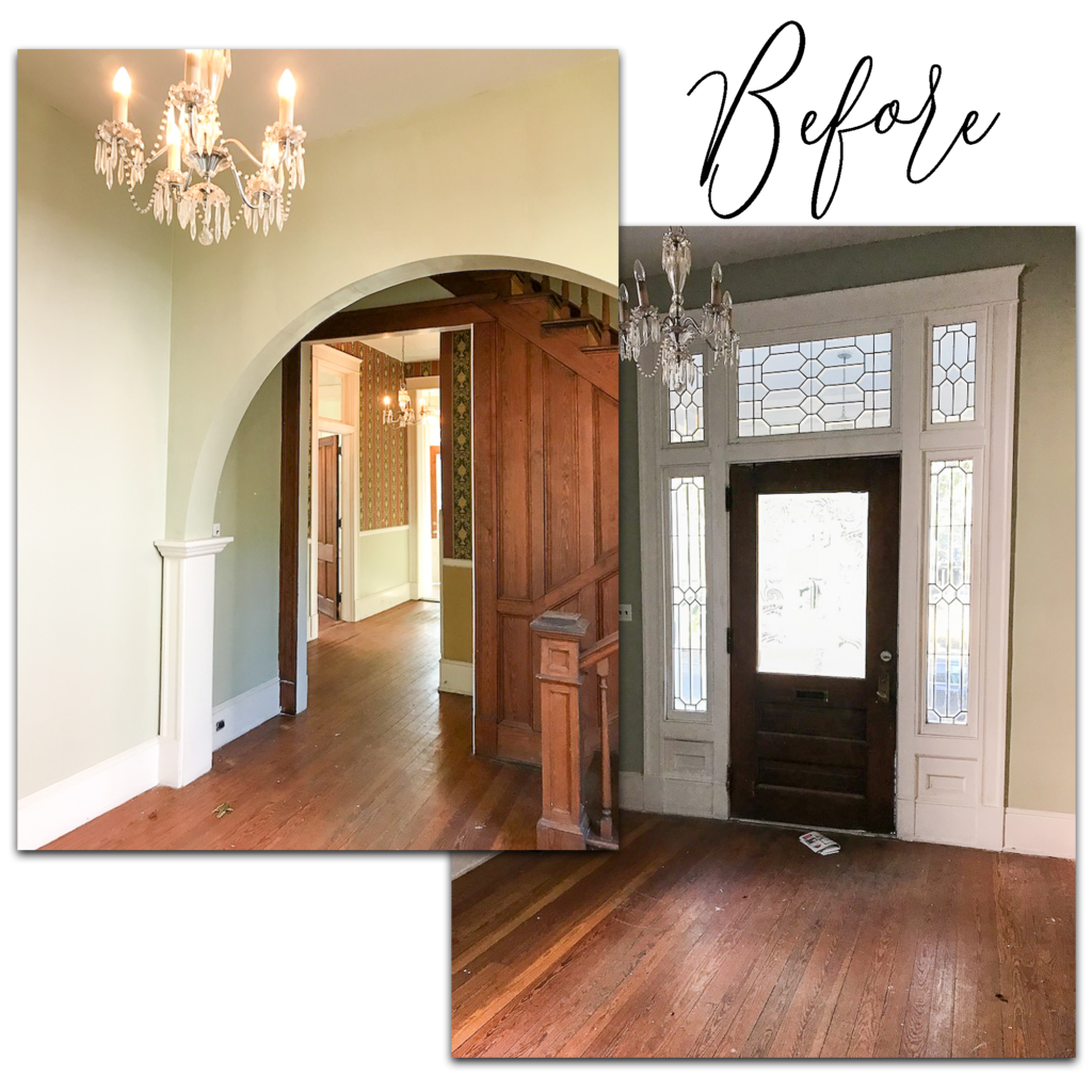
I am 100% a proponent of preserving an old house’s original features. However, I also think design mistakes happened in any decade and this arch was indeed one of them. The overall architecture of the house is so rectilinear that the curvature of this arch seemed so out of place that I was fully convinced it was a 90’s addition. (That was until we stuck a hammer through it.) The scale was off and it felt like long bangs on a pretty girl, hiding the intricate woodwork on the stairs that now greets you when you walk in. Without the arch, the central hallway is now illuminated by light spilling in from the front and rear windows. Our contractor cased the opening to tie into the existing molding and mimic the staircase molding.
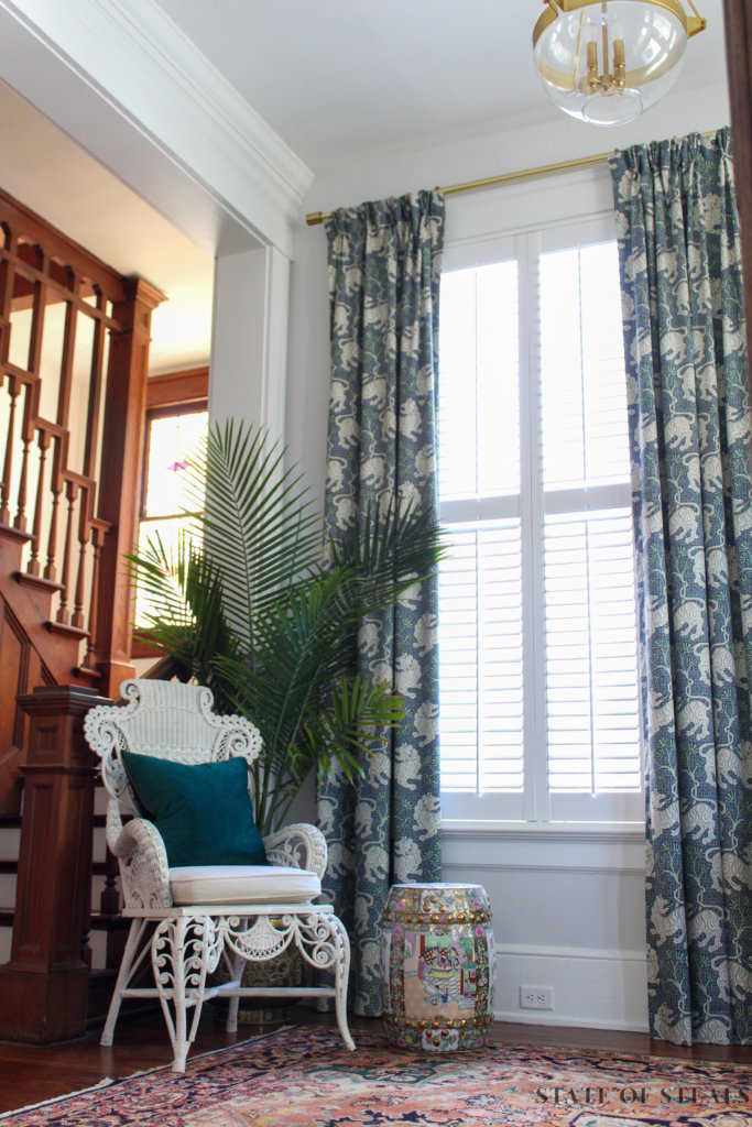
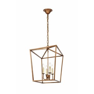
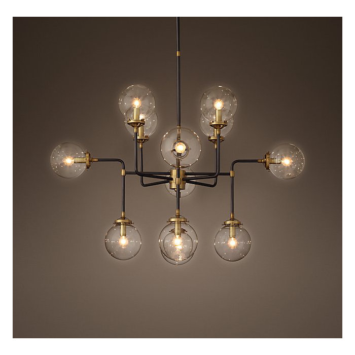
I had hopes of reusing the crystal chandeliers that were existing in this space, however, they required rewiring so it was more cost effective to buy new light fixtures.
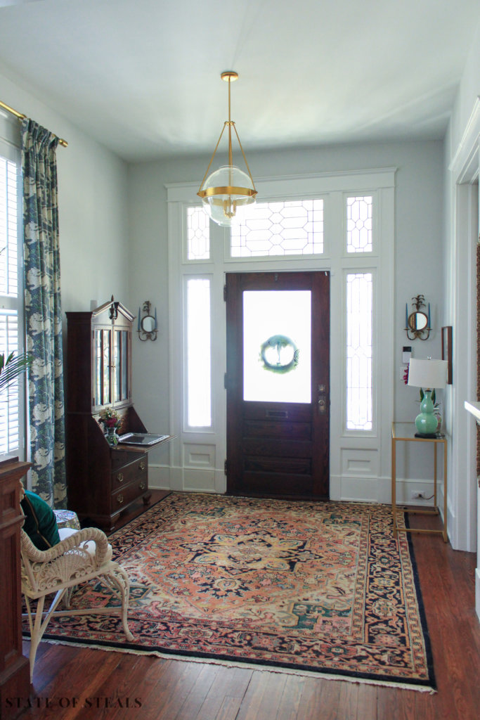
What we did:
- Removed the arch and cased the opening
- Wall color: SW Glacial Stream
Shop my Entry
Guest Bathroom
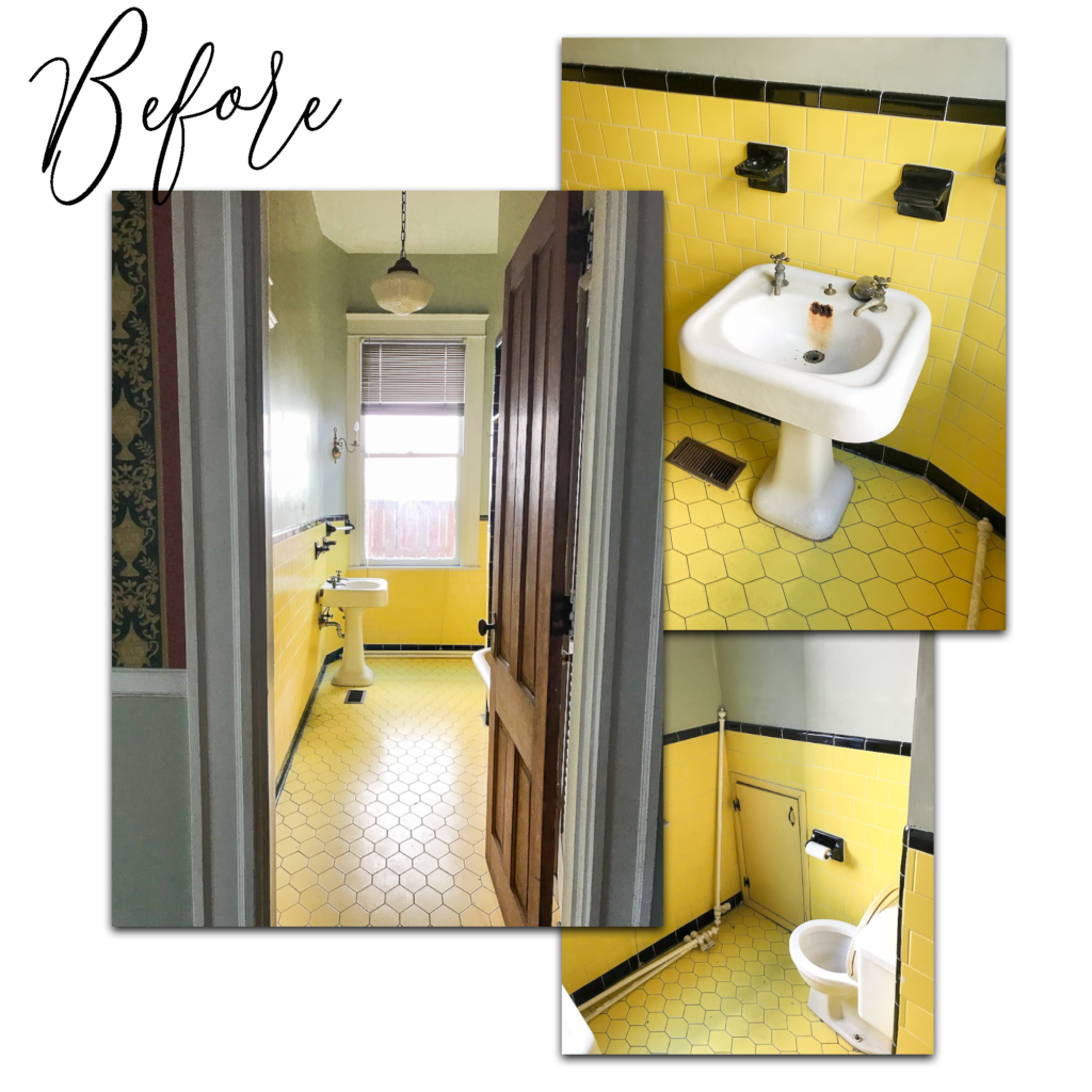
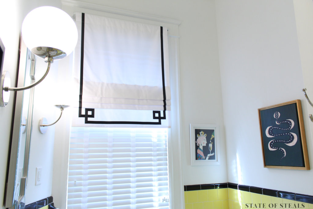
When life gives you lemons…more like lemon colored tile, and your budget is dwindling, you must embrace said electric tile! You may also notice an oddly placed interior window. This was a transom to a former door into the kitchen. Although it serves no purpose and is awkwardly high, something about this relic of a past layout made me keep it.
We saved the iron pedestal sink and clawfoot tub and repurposed the school house light upstairs.
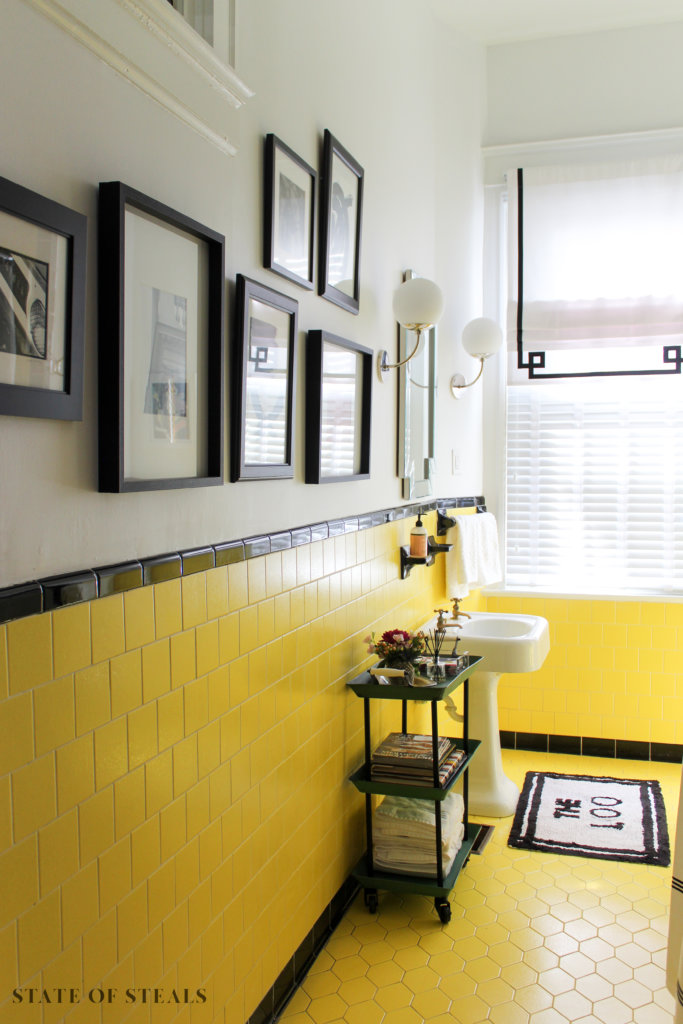
What we did:
- PAINT! (I couldn’t cover the existing sage green fast enough)
- Sink and tub were reglazed
- Installed new light fixtures and ventilation for shower/tub
Shop my Guest Bathroom
Downstairs Hallway
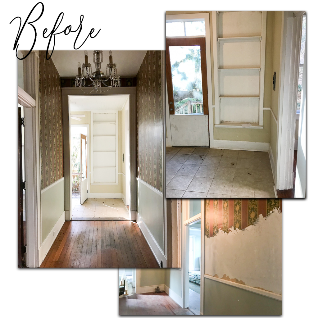
Removing this wallpaper nearly killed me. It was a 95-degree hot southern “spring” day, the house did not have A/C, I was on an 8′ ladder using a steamer to loosen this wallpaper and I’ve never sweat so much in my life. Word to the wise: hire someone to remove wallpaper.
What we did:
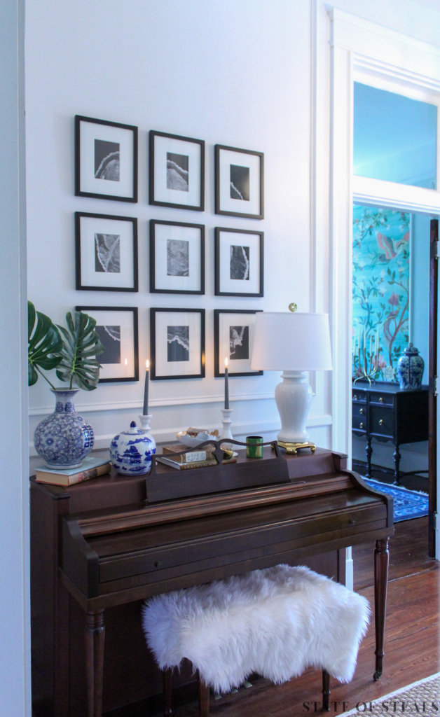
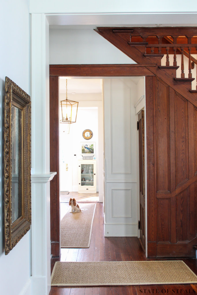
- [Painstakingly] Removed wallpaper
- Added picture moulding
- Upgraded lighting
Shop my Hallway
Living Room
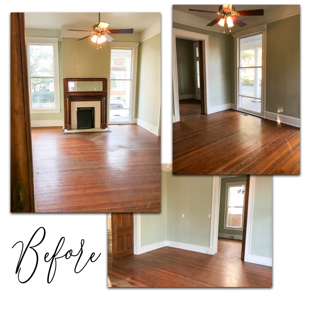
Fun fact: our house was most recently a law firm (for a lawyer with a colorful reputation) and this room was his office.
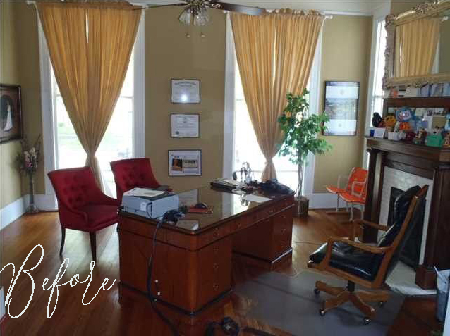
Fortunately, this room just needed some cosmetic tidying. The paint color is SW Glacial Stream.
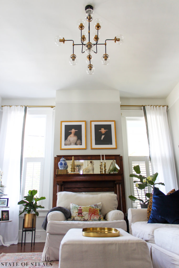
This fireplace, as well as all others in the house, are non-functional because they were originally coal burning and don’t have a wide enough chimney for wood burning. For now, we’re keeping most covered because they’re a huge mess and hassle to clean out.
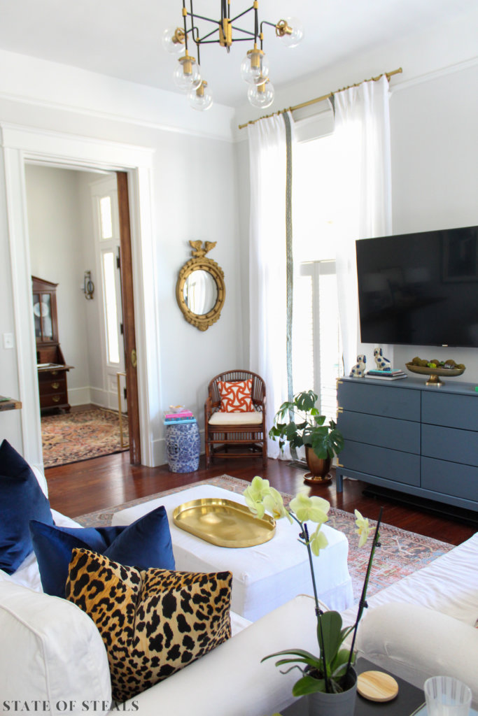
Shop my Living Room
Dining Room
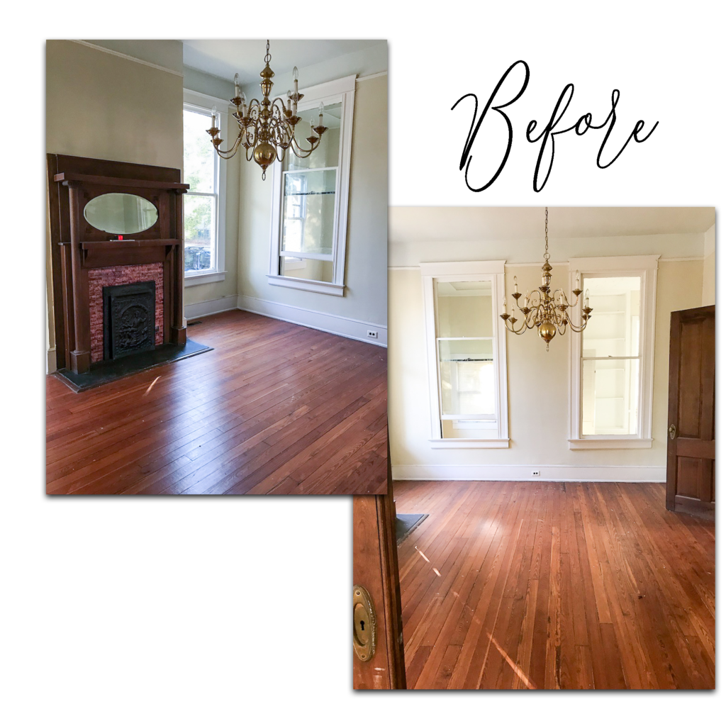
The dining room featured windows to the laundry room and as nice as it might be to monitor the time left on your delicates cycle while enjoying Thanksgiving dinner, those had to go!
The redeeming feature of this room were the two 9′ functioning pocket doors!
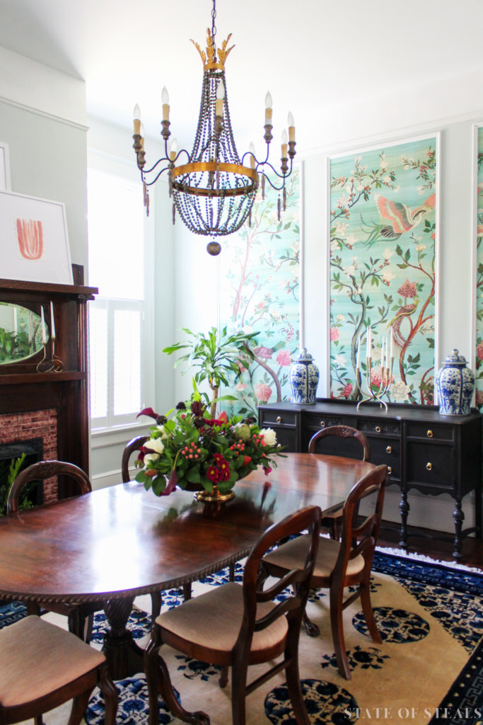
I was intent on incorporating chinoiserie panels in our house and with this new, solid wall in the dining room, the wide open space felt like the perfect pallet for some large-scale chinoiserie panels. Because I’m a baller on a budget, my affordable solution was a wallpaper mural from Anthropologie which we trimmed out to give it that framed panel appearance.
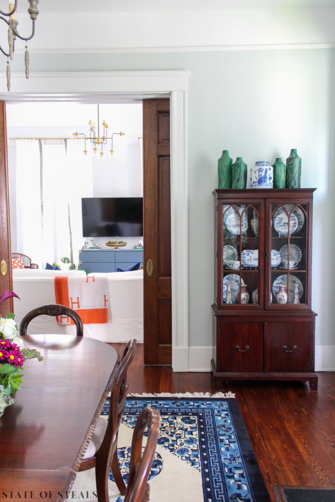
What we did:
- Closed the interior windows (repurposed the glass and trim for damaged windows)
- Refinished the interior doors and fireplace mantle
- Paint color: SW Sea Salt
Shop my Dining Room
Rear Entry
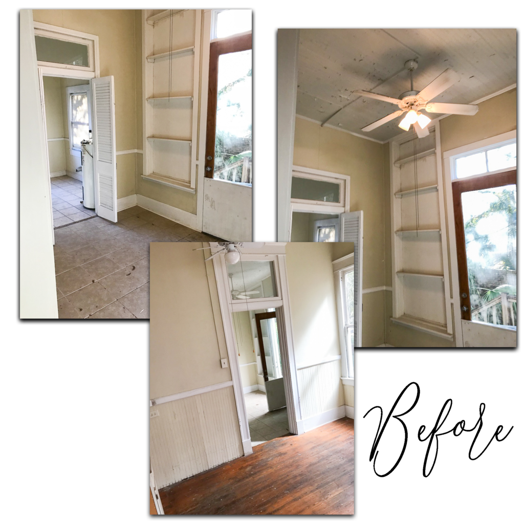
This portion of the house was originally a porch so the floor sloped downward for rainwater drainage. In our house’s past, someone attempted (and failed at) enclosing this porch. This now exterior wall was mush from water infiltration and what used to be windows had been replaced with a single sheet of plywood. The wall was rotten and had to go so most of the rear exterior wall was rebuilt on the first and second floors.
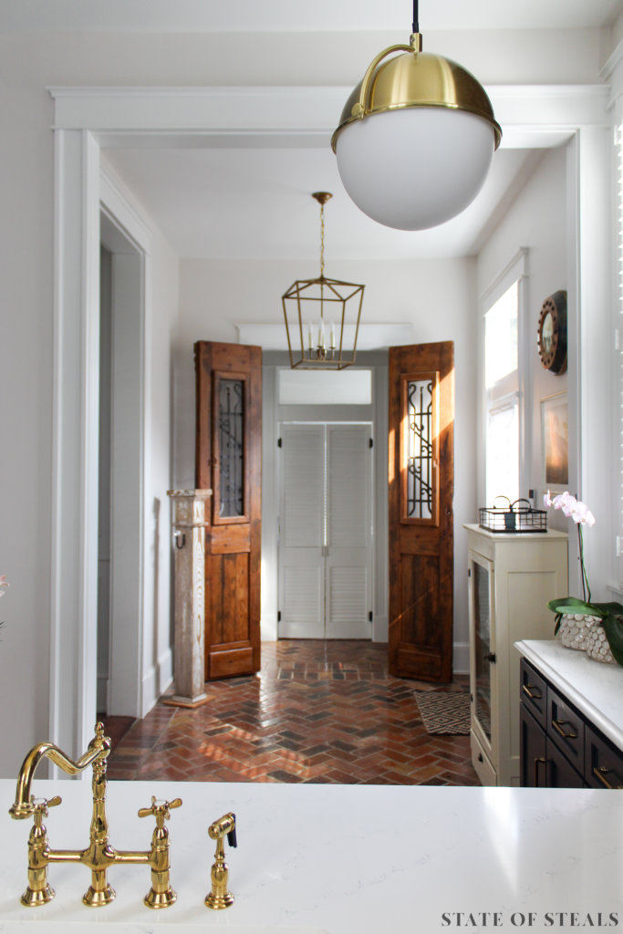
I love the idea of a butler’s pantry but our layout didn’t have room for that so I created the pantry to be walk-through to give it a small-scale butler’s pantry feel. These doors were one of the first pieces we bought for the house and are from Charles Philips Antiques. My husband refinished the doors and our contractor built the opening around them. Behind the white louvered doors (I’m pretty sure these were originally exterior shutters on this house) is our laundry room and make-shift dog kennel. You will not see pictures of that room here unless The Container Store gifts me with a room makeover!
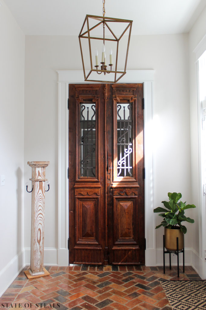
I chose brick pavers of split Chicago brick for the flooring in this area because I wanted something traditional, period appropriate and wouldn’t be a stark contrast to the dark wood floors. These pavers do not show dirt AT ALL and I highly recommend for an entry area.
What we did:
- Rebuilt the exterior wall
- Added a pantry
- Installed split brick floor pavers
- Replaced the exterior door with a door we eliminated elsewhere in the house
Kitchen
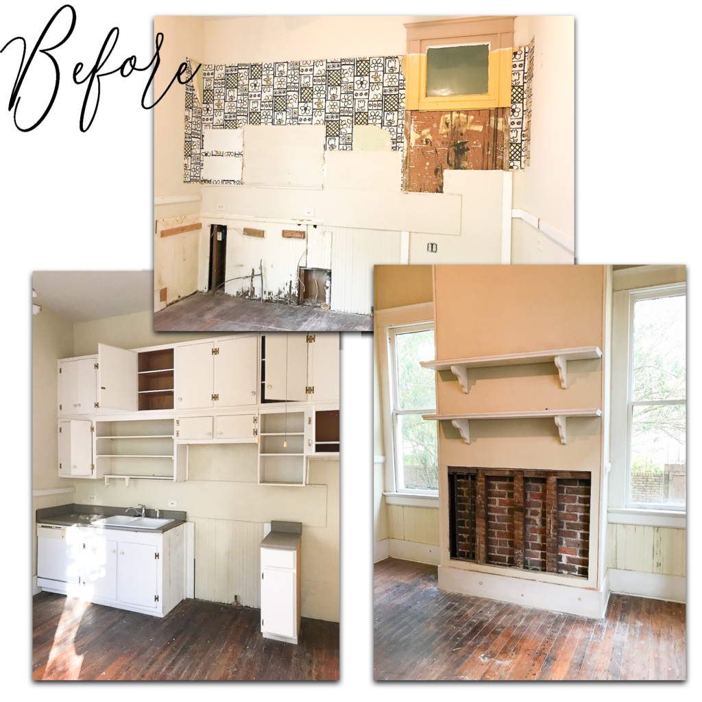
This room was a square with just a few cabinets lined up along one wall that also housed the fridge, sink, stove, and dishwasher. There was a jut out that is directly below a fireplace upstairs so we were hopeful we could reveal some brick which we happily discovered during demo. You will notice a ceramic circle in the upper right corner of the brick wall which is left from an old wood stove that would have been in this room. When we demo’d the cabinets, we revealed some groovy wallpaper which coordinates with the bathroom tile. (The 70’s were not kind to this house.)
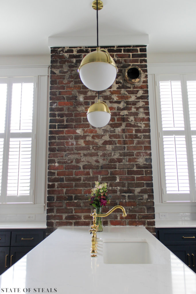
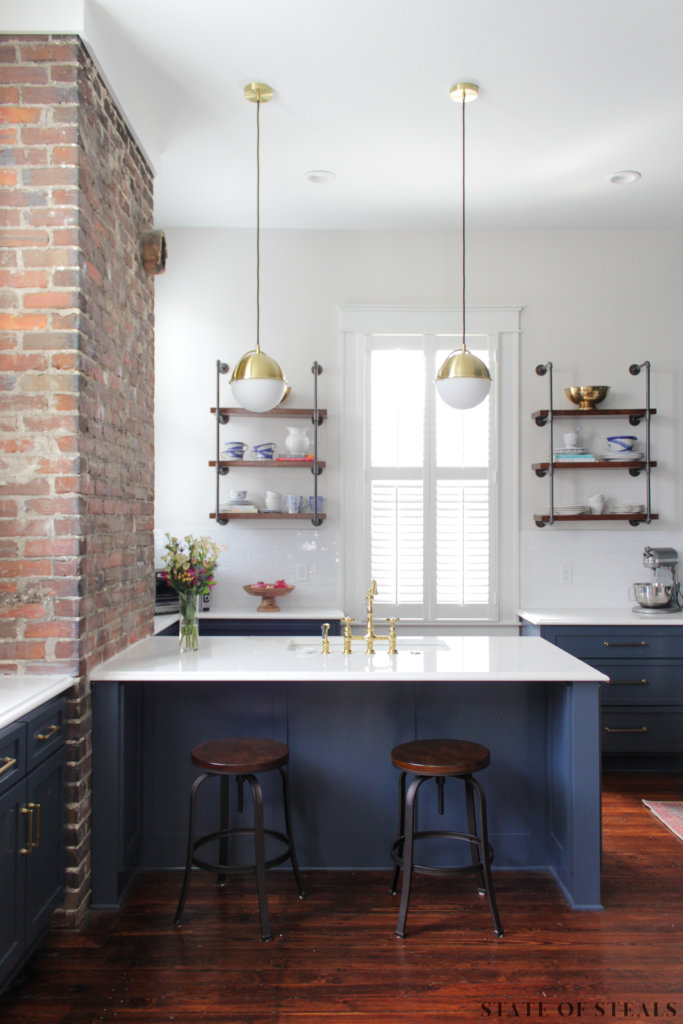
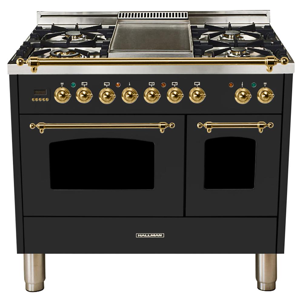
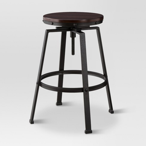
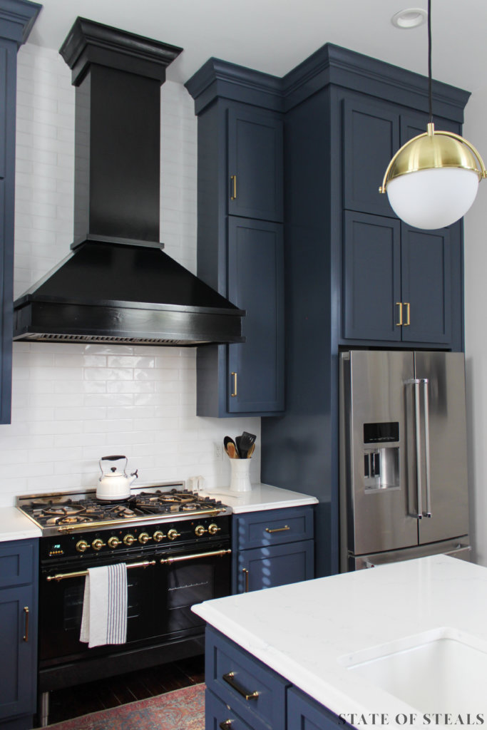
The range is obviously my pièce de résistance and was probably the second design decision I made after the pantry doors. The range is by Hallman Industries and while it’s still a pretty penny, it’s much more affordable than classic French decorative stoves. My cabinet guy thought I was off my rocker when I gave him the paint selection, but I’m in love with the color – no regrets! What’s left on our list for this room is adding brass trim to the range hood and replacing the counter-stools.
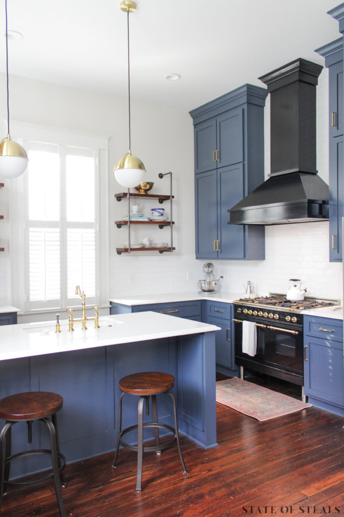
What we did:
- Widened room opening
- Raised windows
- Demo’d wall covering the brick chimney
- Installed new cabinets, countertops, appliances, and lighting
Kitchen finishes:
- Wall color: SW Incredible White
- Cabinet color: SW Sea Serpent
- Countertop: Hanstone Quartz, Tranquility
Shop my Kitchen
Lessons Learned from a Historic Renovation:
It will take longer and cost more than you thought.
If you’re living through the reno, get everything you can out of the house. It will get destroyed. (I found one of my nice washcloths strapped to a Swiffer – props for the guys cleaning up I guess.)
Accept the fact that the wiring, plumbing, and HVAC are probably not in good/safe condition and you should replace them. I love that I can flip a switch and not sniff for smoke.
Don’t let the non-design professionals sway your design decisions (and everyone will be opinionated).
Make sure you can return samples before you spend waste a bunch on buying them.
Your house will not be energy-friendly. Maybe switch to a Prius to counteract the enormous amount of power your house is eating.
The numbers you see on HGTV are a BIG. FAT. LIE.
Remember that a magazine shoot is not happening at your house on day 90 and you do not need to have a fully-decorated grand reveal. It’s okay to slowly chip away at DIY projects and gradually layer in decor.


